In June 2026 the FTC sued one of the most profitable subscription operations on the consumer internet: five products, five audiences, one identical funnel — roughly $106M from U.S. consumers using the same handful of moves.
Each screen below is an exhibit from the filing. The numbered markers match the mechanics the complaint names, quoted verbatim with their paragraph cite. Conduct is alleged; the case is pre-verdict.
"Agency alleges Genesis Tech enterprise and its owners operated misleading internet-based subscription schemes, billed consumers without authorization and made cancellation difficult"
— US Federal Trade Commission, June 17, 2026 ↗
"From early 2023 to mid-2025, these five products accounted for nearly a quarter billion dollars in global revenue"
— US Federal Trade Commission, June 17, 2026 ↗
The playbook, before the brands
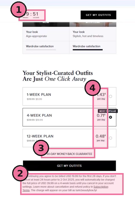
Every flow runs the same steps: a quiz that resolves in the product's favour, prices quoted per day, a ten-minute countdown, a pre-selected plan, an always-win discount, the real recurring charge buried in fine print, then post-purchase upsells. The brand changes; the machine doesn't.
The five products share one playbook. What does that tell you about how this was built?
It tells you the funnel was the product, not any of the apps. When you see five different audiences — ADHD, PDF tools, fashion, astrology, fitness — all running the same countdown timer, the same per-day price framing, the same buried renewal in the same font size, you're looking at a conversion machine that was templated and deployed. The content was the acquisition vehicle. The recurring billing was the business. That distinction matters because it means every person on the growth team knew exactly what they were optimising for.
The five case files
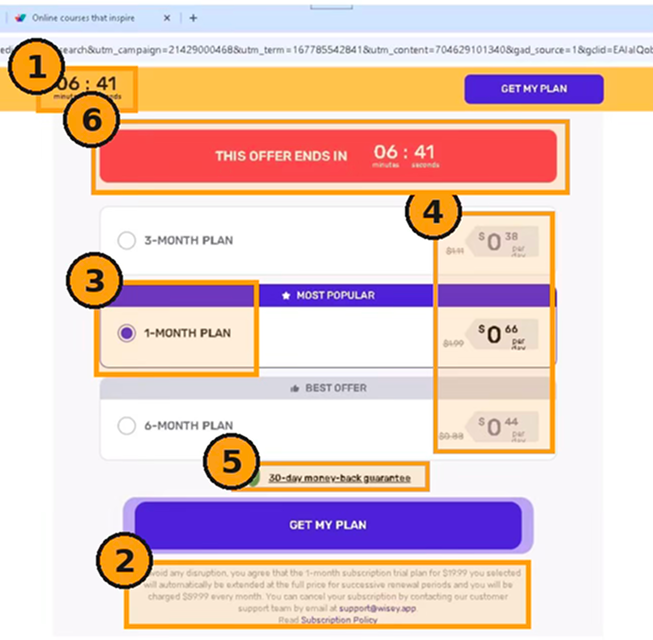
- 1Countdown timer ¶59"After the user clicks 'Continue,' the next screen displays a 10-minute countdown timer, creating a sense of urgency, alongside a large button labeled 'GET MY PLAN.'"
- 2Buried auto-renewal ¶63"Beneath the larger 'GET MY PLAN' button, in the smallest text on the page, the following text appears in gray font on a gray background — disclosing that the $19.99 plan 'will automatically be extended at the full price… and you will be charged $59.99 every month.'"
- 3Pre-selected plan ¶61"The one-month plan, labeled 'MOST POPULAR,' is pre-selected and highlighted in purple."
- 4Per-day price framing ¶61"Each plan is listed alongside a calculated daily price, in each case under $1 per day."
- 5Money-back guarantee ¶62"This page also contains a 30-day money-back guarantee claim in bold font just above the 'GET MY PLAN' button."
- 6Countdown timer (reset) ¶60"Engaging the wheel resets the countdown timer. This creates the impression that the user must act quickly to secure the offered discount."
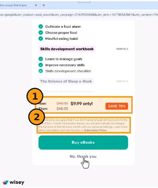
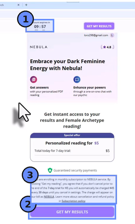
- 1Fake-discount upsell ¶68"After payment, Wisey offers an add-on subscription for an e-book, advertised as '$17.99 only!' with 'SAVE 60%'… Wisey offers a further discount for the same product — '$9.99 only!' — with a flashing 'SAVE 78%' button."
- 2Buried add-on renewal ¶69"In small gray text, which is not clear or conspicuous, Wisey states: if you don't cancel at least 24 hours prior to the end of the 1-month introductory period, you will automatically be charged the full price of $45.00 every month until you cancel at Settings."

- 1One-click charge upsell ¶71–72"Consumers who click the 'Unlock Training' button are charged another fee without their knowledge or consent."
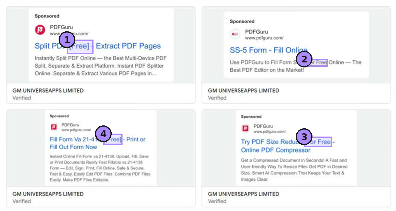
- 1–4"Free" bait ¶78"Many of these ads represent that the products are free to use." Four sponsored results, each carrying the same '[Free]' representation.
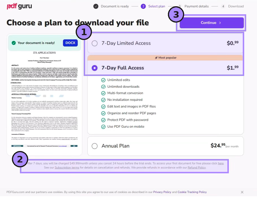
- 1Nominal price bait ¶82"The download/payment interface prominently displays a nominal one-time price (e.g., $0.99 or $1.99) for seven-day access."
- 2Buried monthly charge ¶83"The fine print below the primary content of the page states: 'After 7 days, you will be charged $49.99/month unless you cancel 24 hours before the trial ends.'"
- 3Skip-past "Continue" ¶84"The user could click the large, purple 'Continue' button at the top of the page and proceed to the payment page without the fine print ever appearing on their screen."
Which of the 36 mechanics worries you most when you see it in other funnels?
The 'continue' button that lets you skip past the fine print without it ever appearing on screen. That's ¶84 in the PDF Guru case. It's not ambiguous — it's a button placed specifically so that a reasonable user following the natural path never sees the renewal terms. I see variants of this constantly: important disclosures placed below the fold of a modal, terms that only appear if you scroll a secondary panel, pricing footnotes in a colour that renders as invisible on the background behind them. Everyone calls it 'reducing friction.' The FTC has a different name for it.

The enterprise behind the screens
Founders Vladimir Mnogoletny and Vasily Ulianov allegedly ran this through a d/b/a called Genesis Tech since at least 2020: Cyprus entities market to U.S. consumers, Delaware counterparts process payments, across dozens of shell companies under Arbor Mundi (BVI). Five products produced nearly a quarter-billion dollars globally; linked accounts moved ~$700M through PayPal in the year to September 2025.
The five counts
| Count | Statute | Paragraphs |
|---|---|---|
| Failure to disclose material terms | FTC Act §5 | ¶158–160 |
| Unfairly charging consumers without authorization | FTC Act §5 | ¶161–163 |
| Failure to clearly & conspicuously disclose material terms | ROSCA §4(1) | ¶170–171 |
| Failure to obtain express informed consent | ROSCA §4(2) | ¶172–173 |
| Failure to provide a simple cancellation mechanism | ROSCA §4(3) | ¶174–175 |
Run it against your own funnel
Most of these moves pass as "growth best practice" until a regulator reframes them as deception. The line is whether a reasonable consumer understands what they're agreeing to and what they'll be charged.
The checklist at the end — what should someone actually do with it this week?
Run it against your current checkout flow with someone who has never seen your product. Not a colleague — someone genuinely unfamiliar. Ask them to talk through what they think they're agreeing to at each step. If they can't accurately describe the recurring charge and how to cancel it before they reach the payment screen, you have a ¶84 problem. The checklist items aren't hypothetical — each one maps to a specific count in the complaint. If you can't answer yes to all eight, you're not in a grey area, you're in the area the FTC just sued.
The Genesis brands didn't fail on one outrageous move — they stacked nine ordinary ones. Better to catch that in a teardown than a docket.

What made you read the FTC complaint in full rather than rely on the press coverage?
Press coverage of FTC actions tends to lead with the headline number and move on. But the actual complaint is where the mechanics live — the specific paragraph cites, the exact screen descriptions, the sequence of what each screen shows and hides. I've seen too many 'growth hacks' presented at conferences that are verbatim what the FTC is describing as unlawful. I wanted a document I could hand to someone and say: here is the exhibit, here is the paragraph, here is why this is not a grey area.